Design System · Internship · Data Science Research Services
Building a Design System for DSRS DataHub
The Problem
The DSRS DataHub had grown page by page without a shared visual language. There were no documented standards, no reusable components, and no consistent way to present datasets, services, or research tools.
Diagrams were visually noisy with no clear reading order and every team member had to reinvent the same UI patterns. The site worked, but it did not feel like one product.
Research
I audited existing pages, mapped repeating layouts, and noted where researchers actually got stuck: finding datasets, understanding what a page was for, and trusting that two parts of the site belonged together.
I looked at comparable research platforms and Illinois brand constraints, then listed the smallest set of components that could cover the majority of pages without forcing a redesign of every screen at once.
Building
I turned the audit into a small, copyable system; components with a clear job, so the next page would be easier than the last.
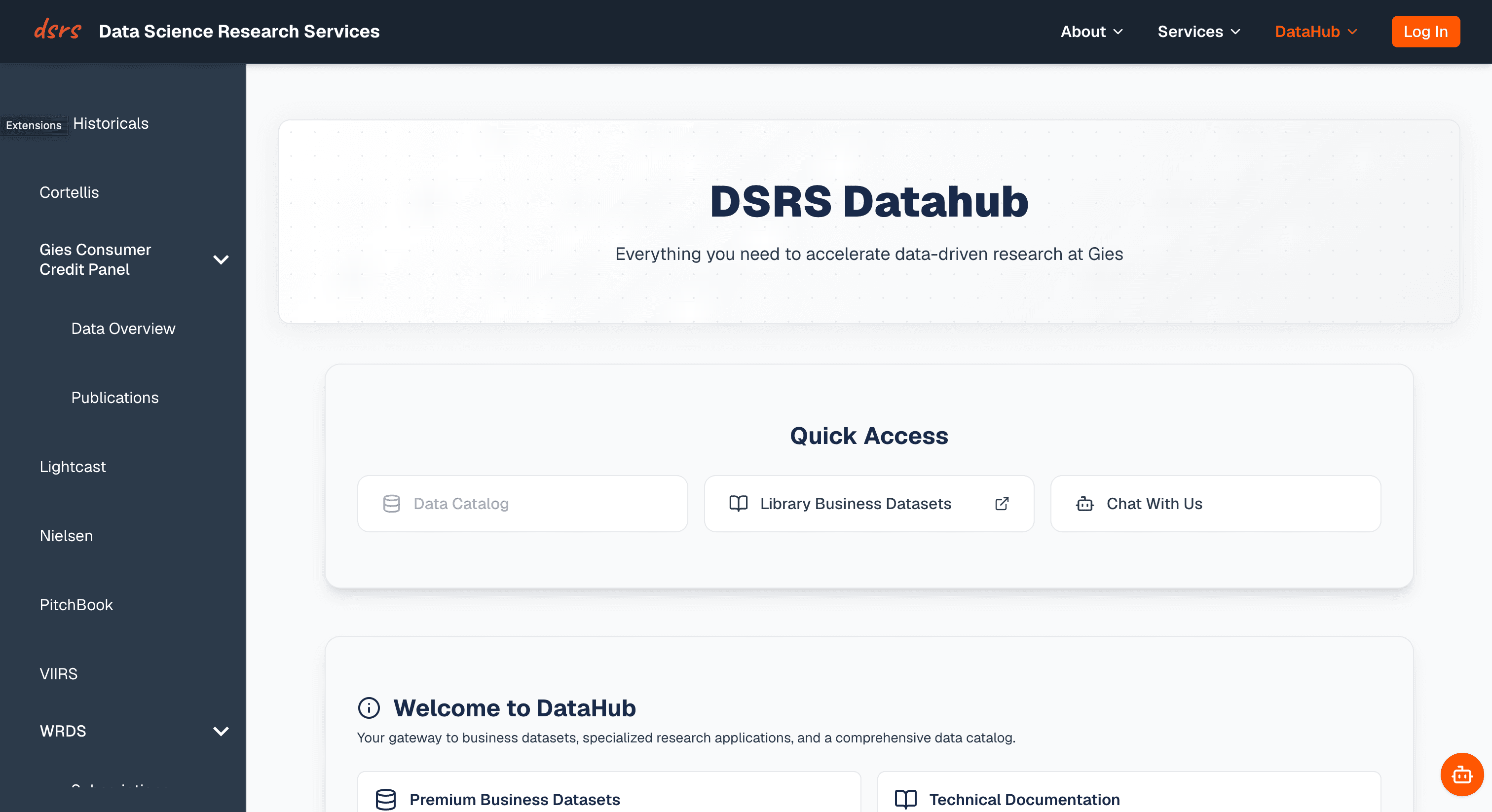
- HeroBanner: a standardized header with a title, and supporting description, so every landing page opens with the same rhythm.
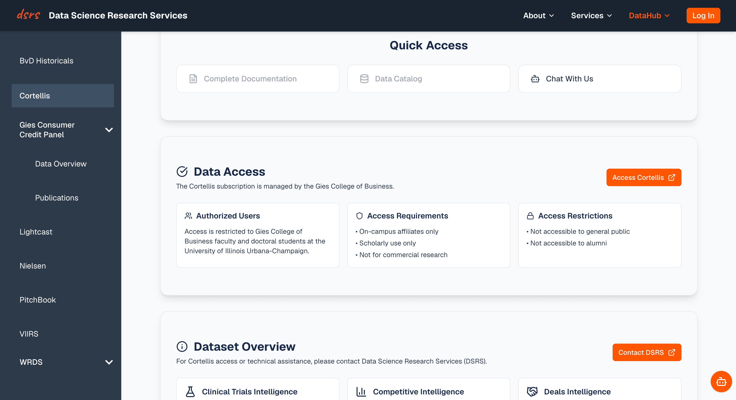
- QuickAccess: quick links to related pages that were consistent across all datasets.
- DataAccess: a three-part component covering Authorized Users, Requirements, and Restrictions, replacing scattered text.
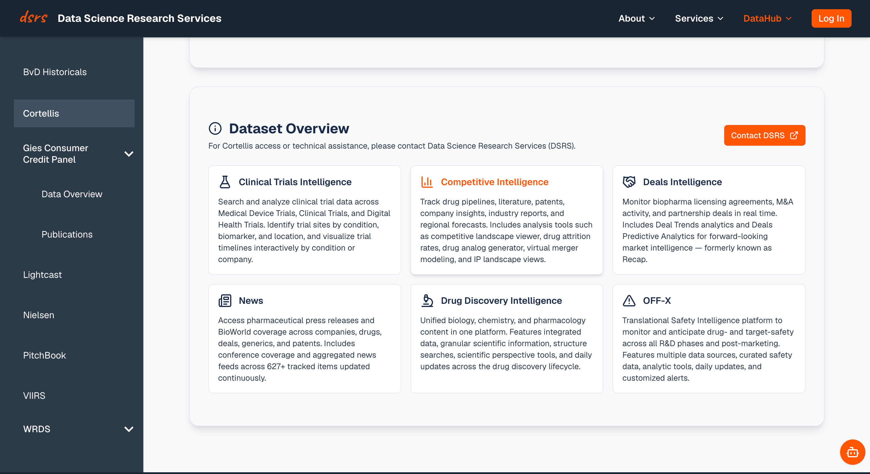
- DataOverview: a customizable card grid showing dataset categories with an orange hover state for interactivity.
- DataDetails & DataDetailsGroup: gray outer, white inner card system for flexible content display with scrollable schema tables to prevent endless vertical scrolling.
Design Decisions and Why
Early on, we used orange icons throughout the DataHub page. It felt on-brand for UIUC, but when we looked at the pages, everything was orange: icons, buttons, hover states, accents. Nothing stood out. We switched icons to black and reserved orange strictly for buttons and interactive hover states. Now orange means something and has a job.
Good design systems aren't just what users see. I renamed dozens of files to follow consistent conventions: PascalCase for components, camelCase for utilities, kebab-case for CSS and MDX. Then I wrote a Contributing Guide so future employees would know exactly where everything goes and why.
What I learned
Standardization is a design decision. Naming a file HeroBanner.tsx instead of hero-banner.tsx is the same instinct as choosing gray-on-white cards over a mix of styles. A design system is about making the next page easier than the last. Consistency is a team effort: the system only works if people can find the pattern, understand why it exists, and reuse it without asking.